Designing Colby College's Football Uniforms
Sawyer Busny, 2025 Season
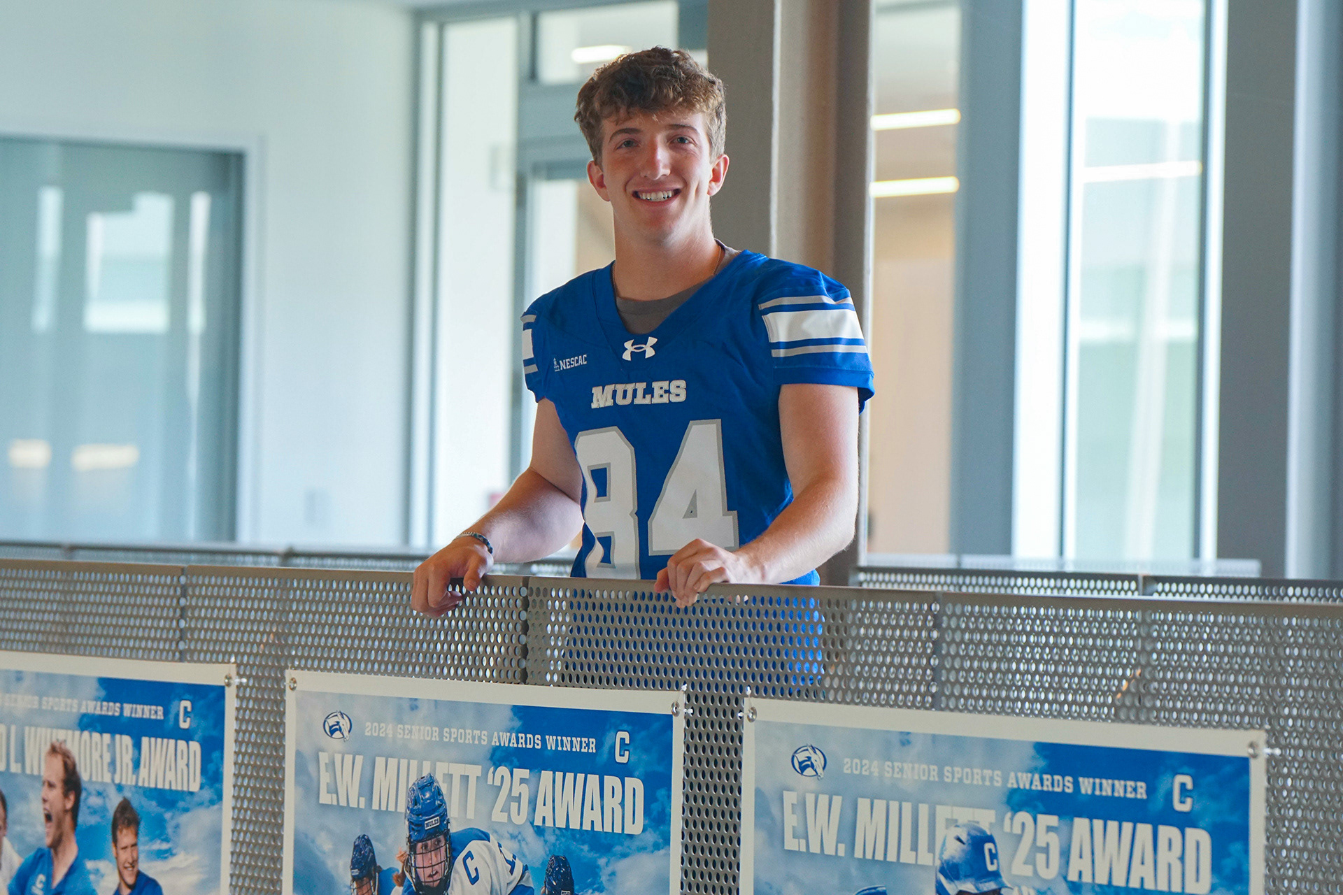
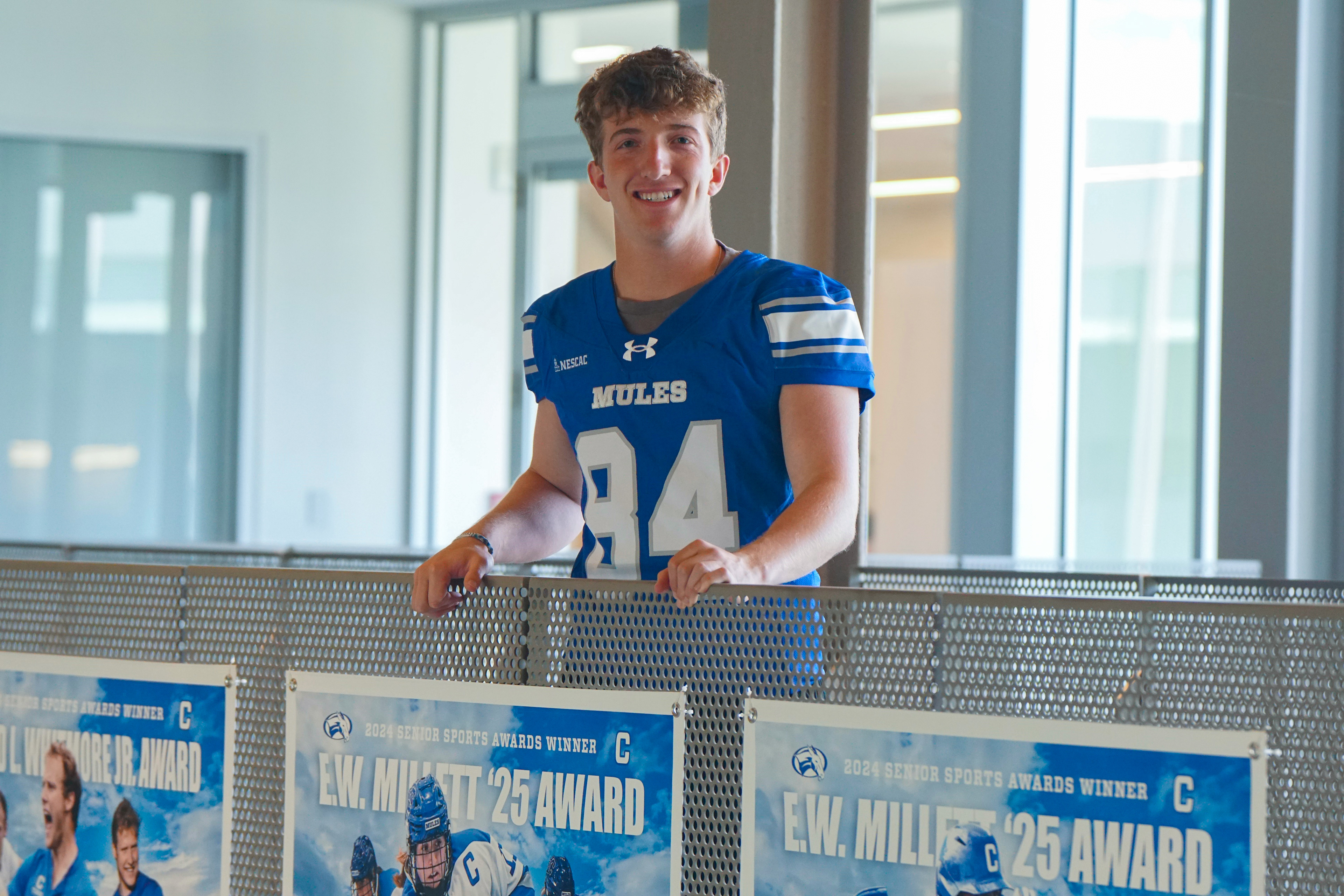
I spend most of my free time designing uniforms across a variety of sports.
At Colby College, that interest started through personal creative projects. I spent countless time sketching, designing, and photoshopping concepts across many sports. I loved exploring how design can shape identity, tradition, and perception.
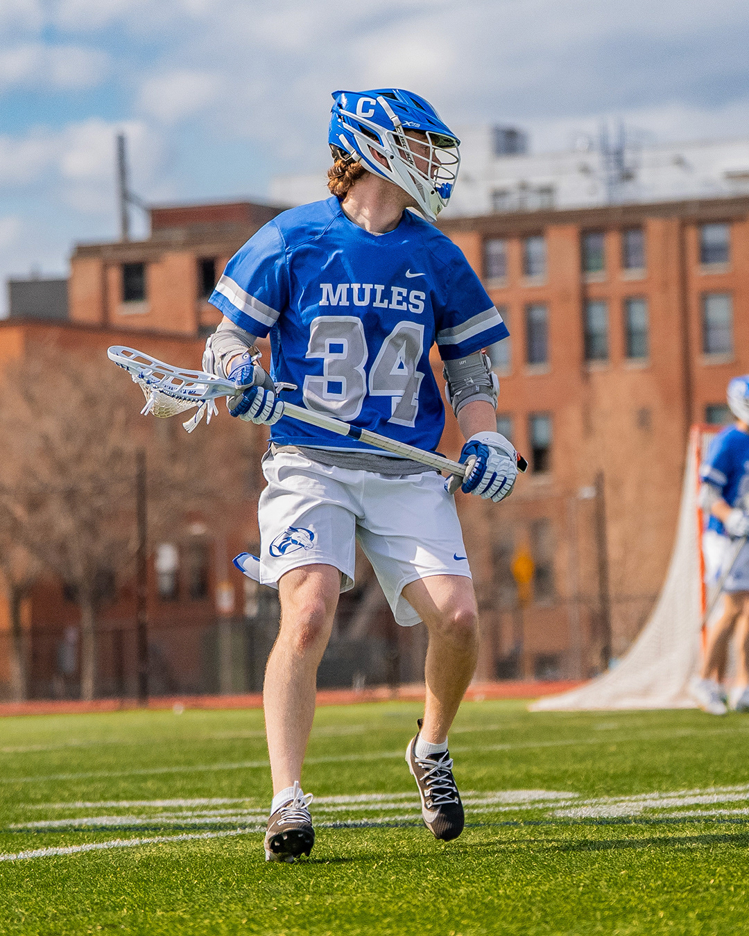
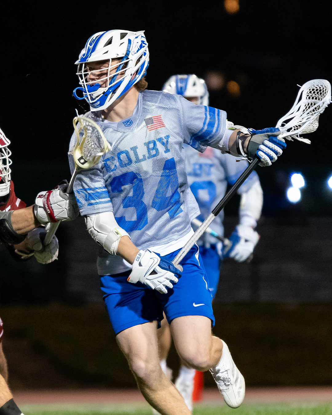
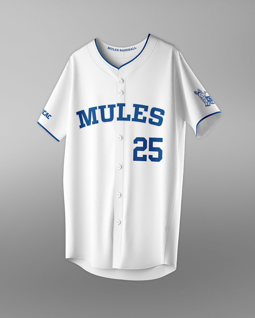
Over my four years at school, I worked across Colby Athletics on branding, social media, and creative projects, helping build a more cohesive visual identity across teams. Through that experience, I developed a broader understanding of how design systems support athletic programs, but uniform design has always remained my focus. I have been extremely grateful to have the opportunity to design uniforms across Colby and the New England Small College Athletic Conference (NESCAC).
My interest and work ultimately led to the opportunity to rethink and redesign Colby Football’s on-field identity from the ground up. This article is a look at that process: how Colby Football’s uniforms were designed, and the thinking behind every decision that made it onto the field.
Designing football uniforms was always my dream, and for a long time, Colby Football’s uniforms were nothing special.
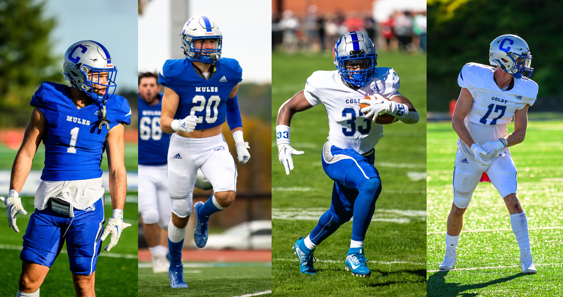
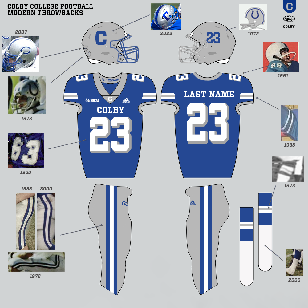
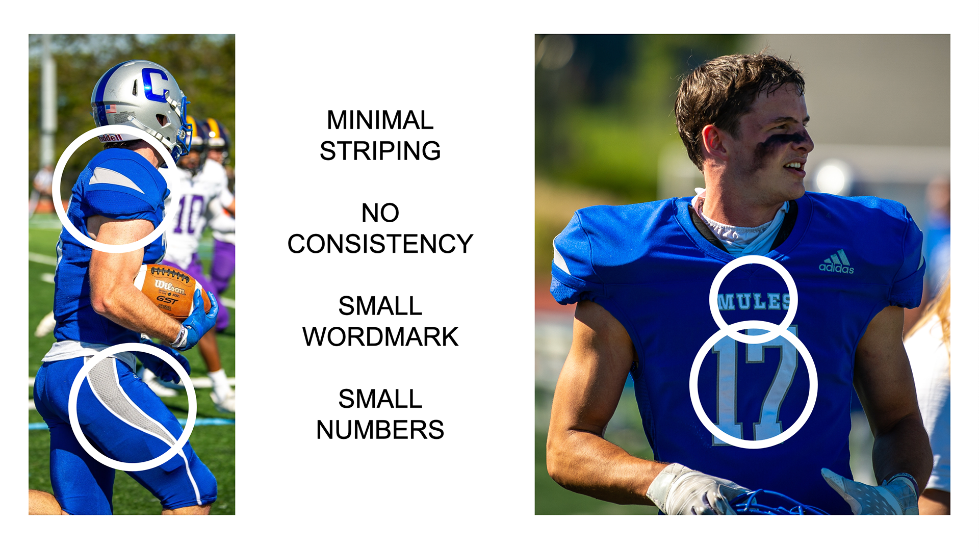
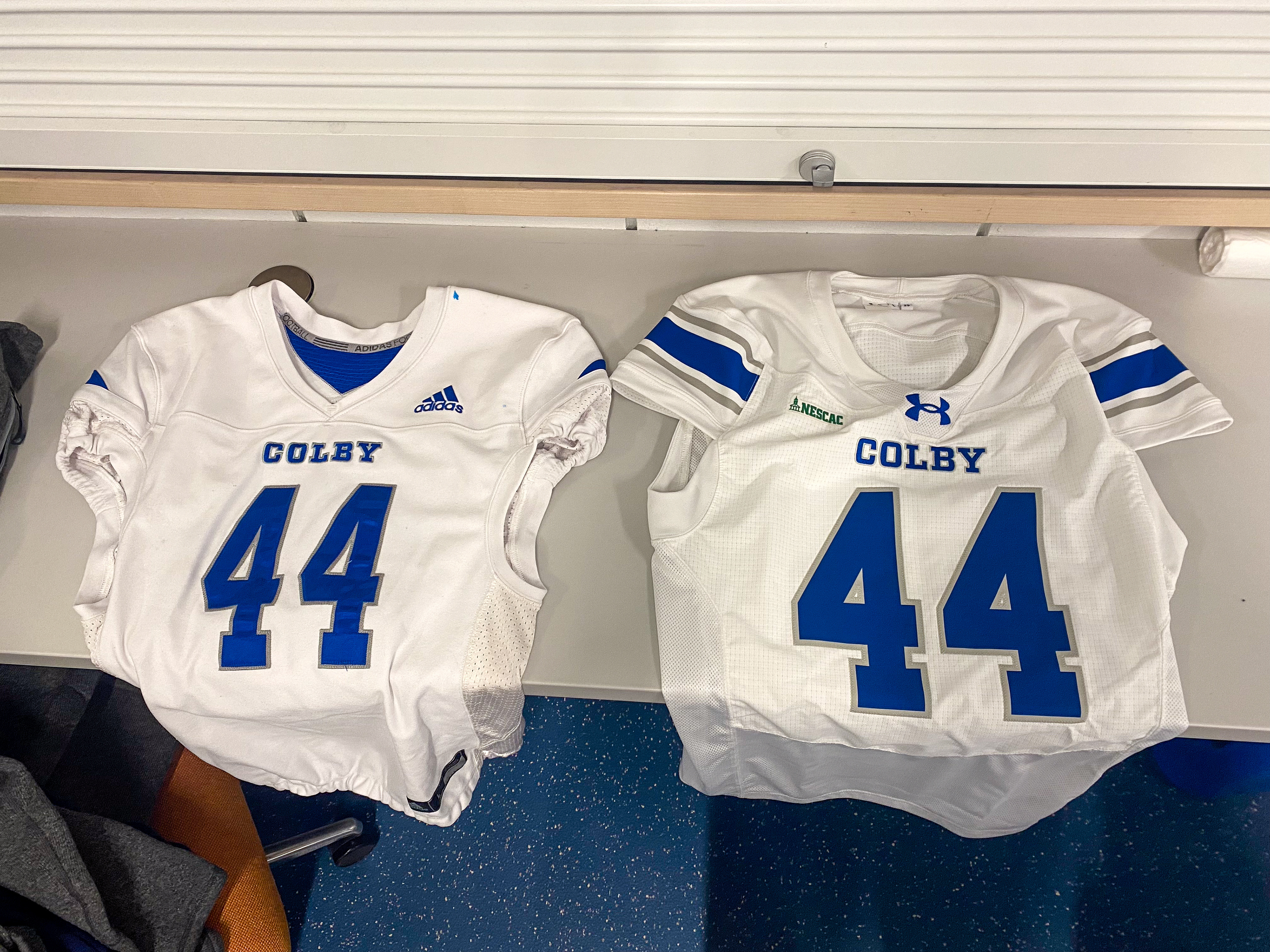
The Adidas sets we wore were loose-fitting, lacked any real identity, and featured a small, hard-to-read wordmark and tiny numbers that even made it hard for fans to follow who was on the field. My teammates would complain every year, “We need new uniforms.” I agreed. And while we waited, I kept researching, working on my skills, and building concept after concept, just in case the opportunity came.
__________
Pitching the Idea
That opportunity came right after my senior season. One week after our final game, the conversation about new uniforms officially started and I was ready.
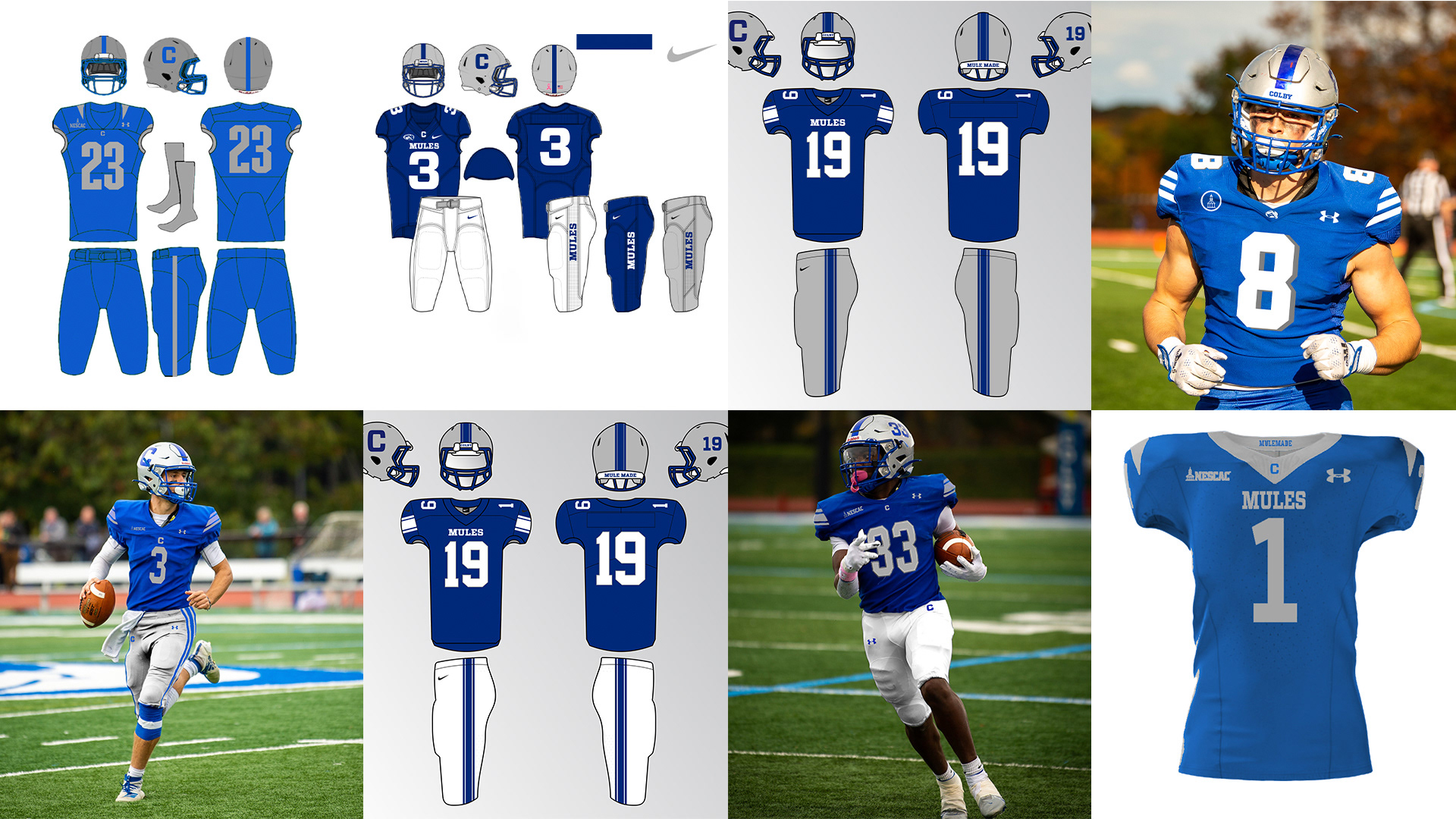
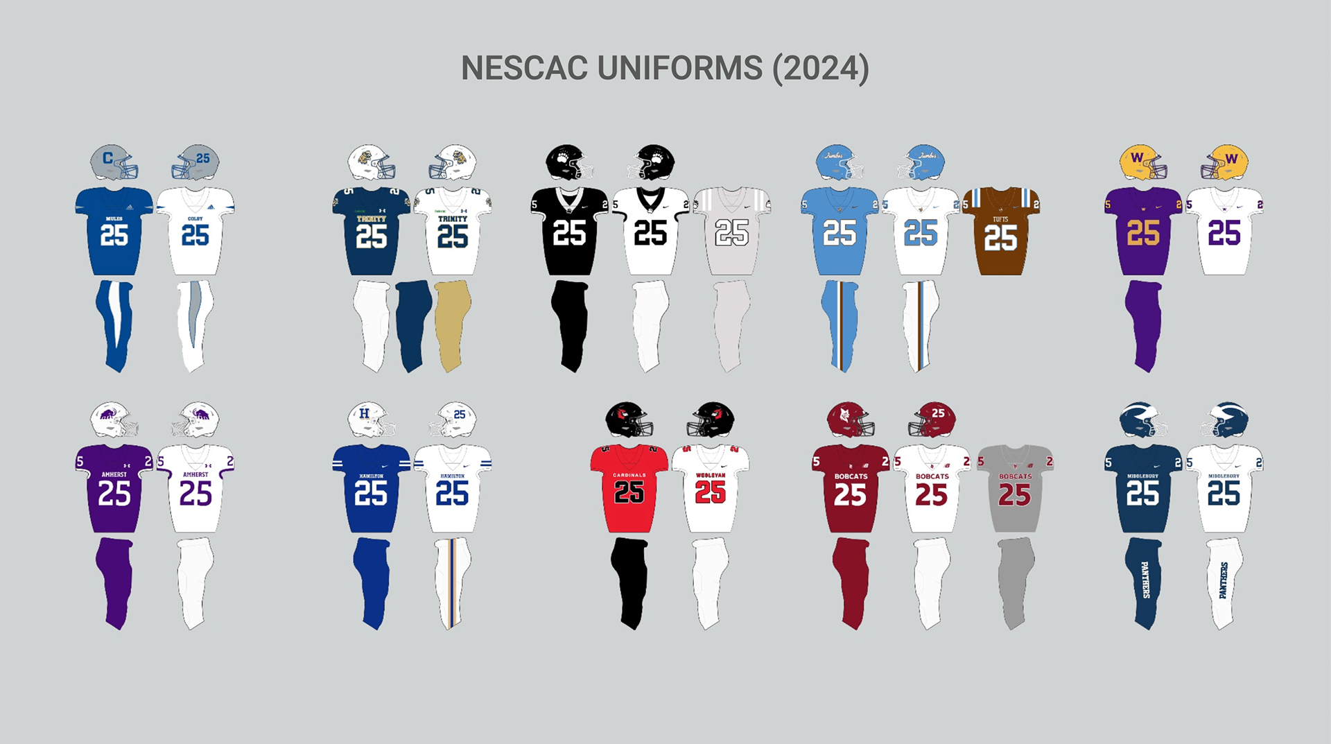
I put together a full pitch presentation for our coaching staff and equipment manager. I outlined the issues with our current uniforms, compared us to the rest of the NESCAC (where nearly every other team had upgraded their look in the past few years), and proposed a set of goals for what Colby’s next uniform set should look like:
- A uniform that stands out in the conference
- Legible numbers for fans and stream viewers
- More Colby branding across the jersey
- A look that players feel good wearing
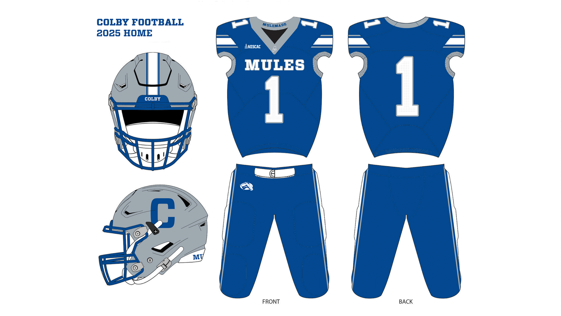
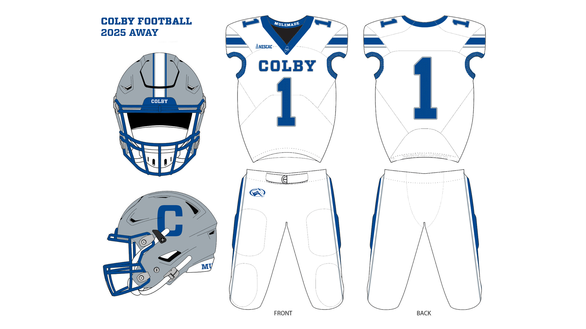
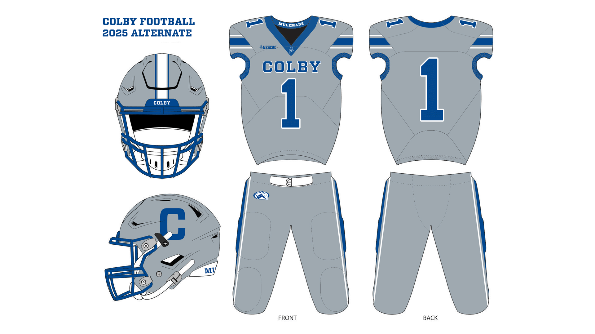
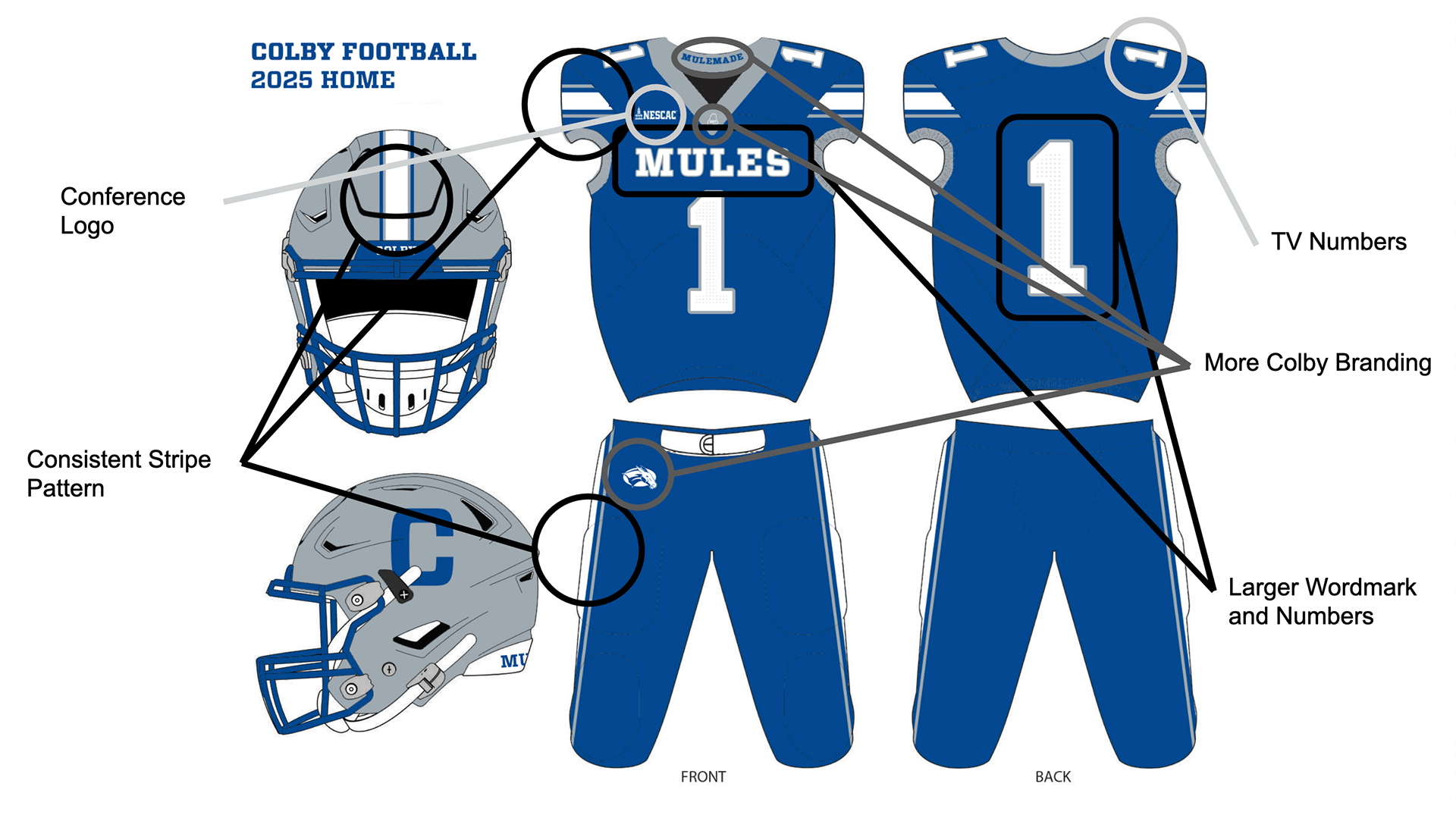
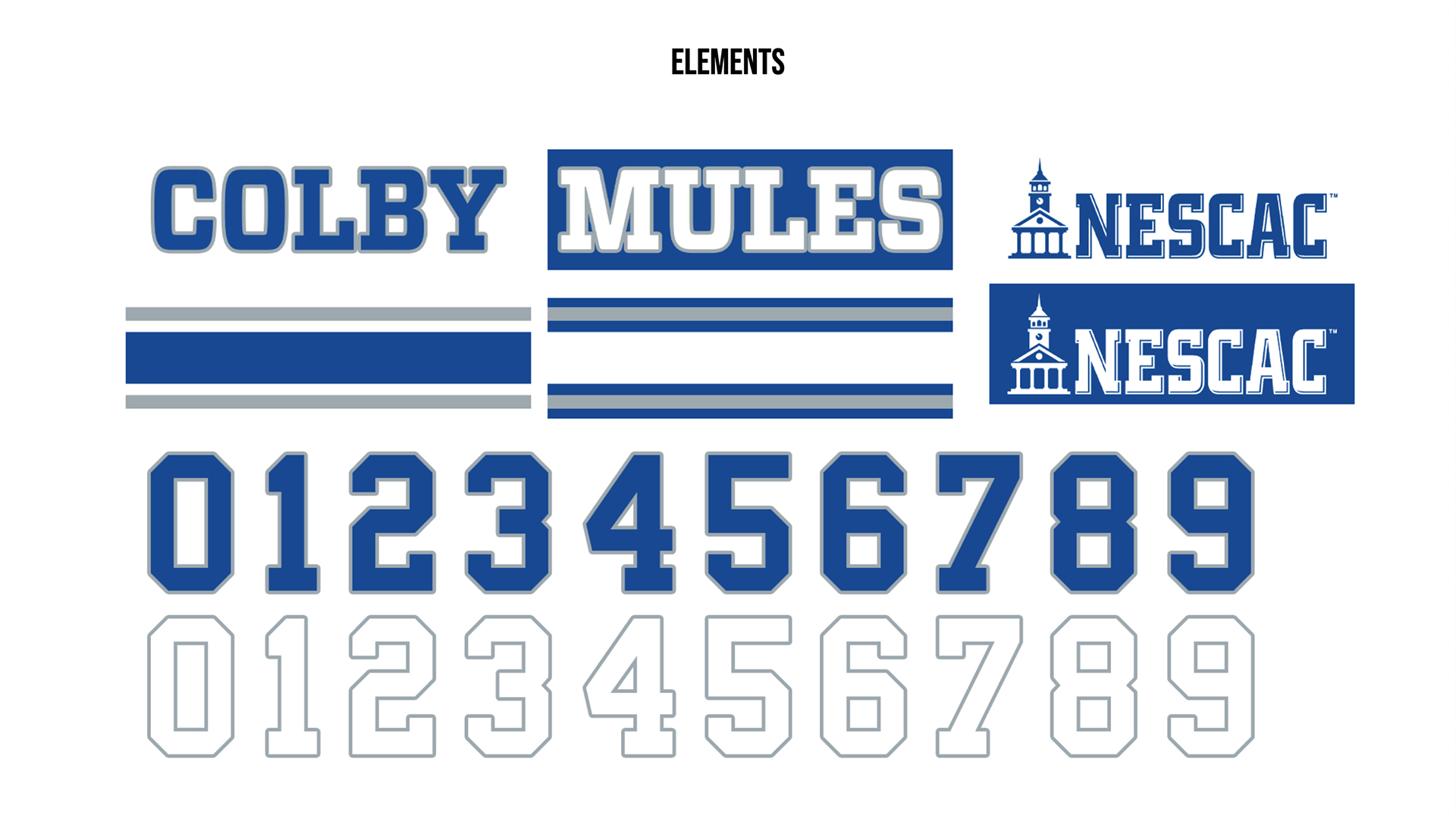
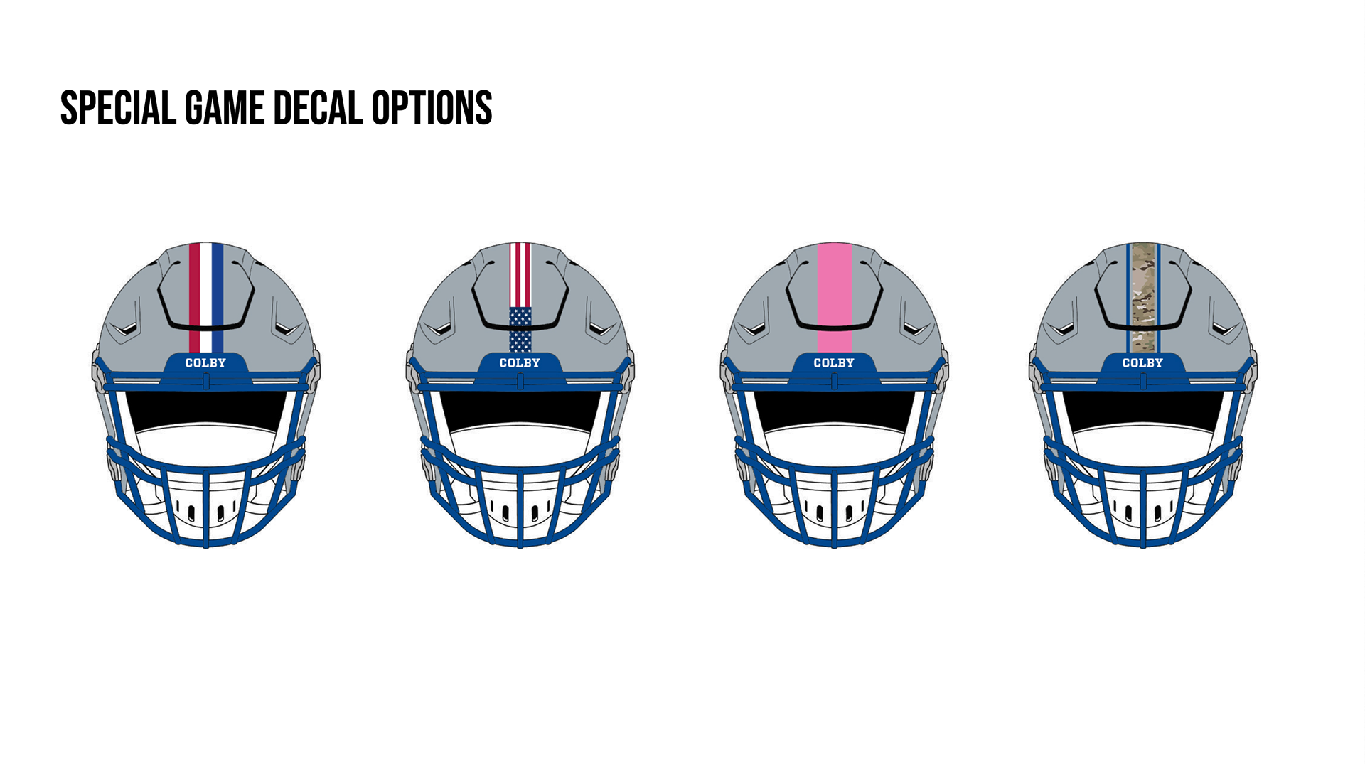
I also showed how we could accomplish this: consistent striping, larger wordmarks and numbers, unique Mule logos, and even helmet decal options. My goal was to make sure Colby had a look that players felt confident wearing every Saturday as well as being attractive to recruits.
__________
The Under Armour Call
Thanksgiving break had just started when I got a text from a rep at a third-party company that works directly with major uniform manufacturers. These types of reps essentially act as a bridge between schools and companies like Nike, Adidas, or Under Armour, making the process smoother.
The rep told me that, in his opinion, Under Armour was the best fit for us not only from a branding and performance standpoint, but also logistically. Their availability, pricing, and customization process fit exactly what we needed. They were also offering their new uniform chassis: the ARMR 037, the same uniform used by Notre Dame. Our equipment manager (who I’d worked closely with throughout the process) shared this belief.
A week later, I was on a Zoom call with the third-party rep and a representative from Under Armour. We talked through every detail: lead times, design feasibility, color matching, the number of jerseys and pants, and what our financial limitations were.
One of the more surreal moments was screen-sharing mockups I had created and walking the UA rep through the reasons behind each element: why we wanted TV numbers, why we needed a larger “COLBY” wordmark, and how the silver pants would tie back to our metallic silver helmets.
Click here to view the presentation.
Because I’d earned trust from my coaches over time both as a player and as someone who’d taken on a lot of creative responsibilities for the program, I was allowed to spearhead the design process. It’s not every day that a student-athlete gets to present uniform specs to a national brand rep, but it was a conversation I had unknowingly prepared for over the previous four years.
__________
Breaking Down the Deck
The presentation I gave to our coaching staff was something I had quietly worked on for months. Titled “Colby Football Uniform Redesign 2025,” the deck laid out exactly what I believed needed to change and how to fix it.
Here’s what it covered:
The Problems:
Right up front, I listed four main issues with our current uniforms:
- Minimal Striping – No visual identity
- No Consistency – Different elements clashing across jersey/pants/helmet
- Small Wordmark – “COLBY” barely noticeable
- Small Numbers – Hard to read, especially in photos and live streams
The Goals:
Then came the core design principles:
- Create a unique identity within the NESCAC
- Be immediately recognizable on the field
- Improve visibility for fans and media
- Prioritize player comfort and pride
NESCAC Uniform Research:
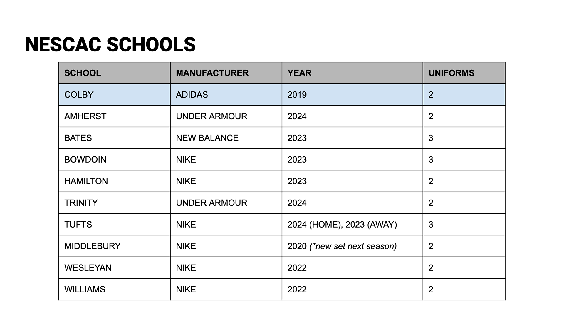
I broke down every other team in our conference by brand, year of last update, and style. Nearly every other program had been upgraded since 2022 with several having three full uniforms and mixing in unique striping or logo placement. This comparison helped drive home the point that Colby was falling behind.
Solutions:
I offered actionable suggestions to meet each goal:
- Sleeve striping to create identity
- Larger fonts for the wordmark and numbers
- Custom patches (e.g. NESCAC logo)
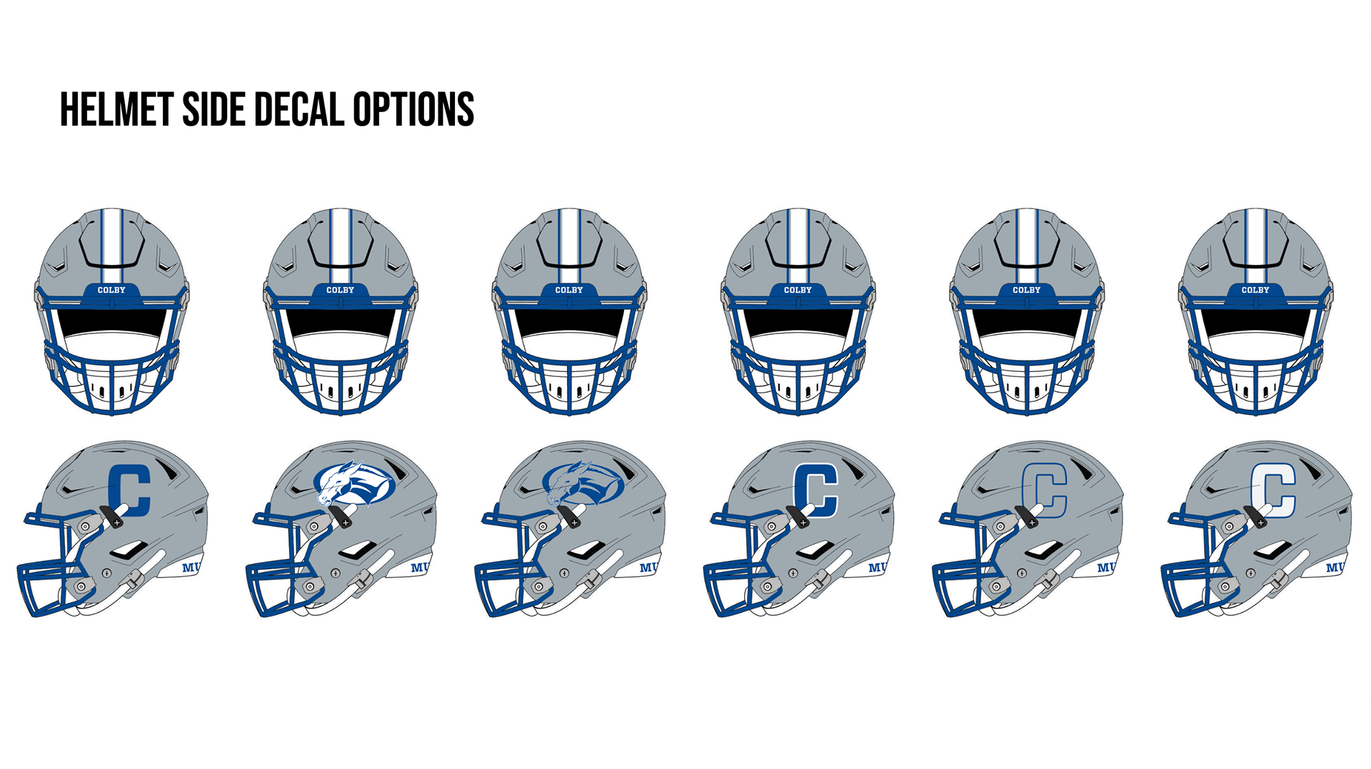
- Mule branding and helmet decal options
- More combinations to give the team flexibility
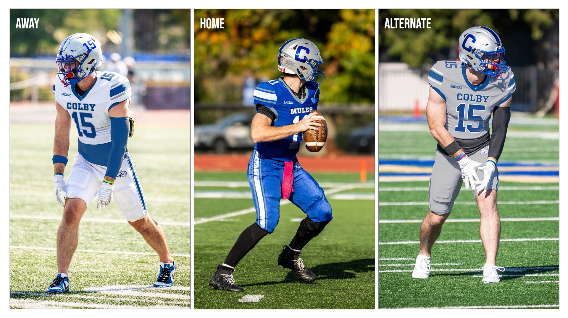
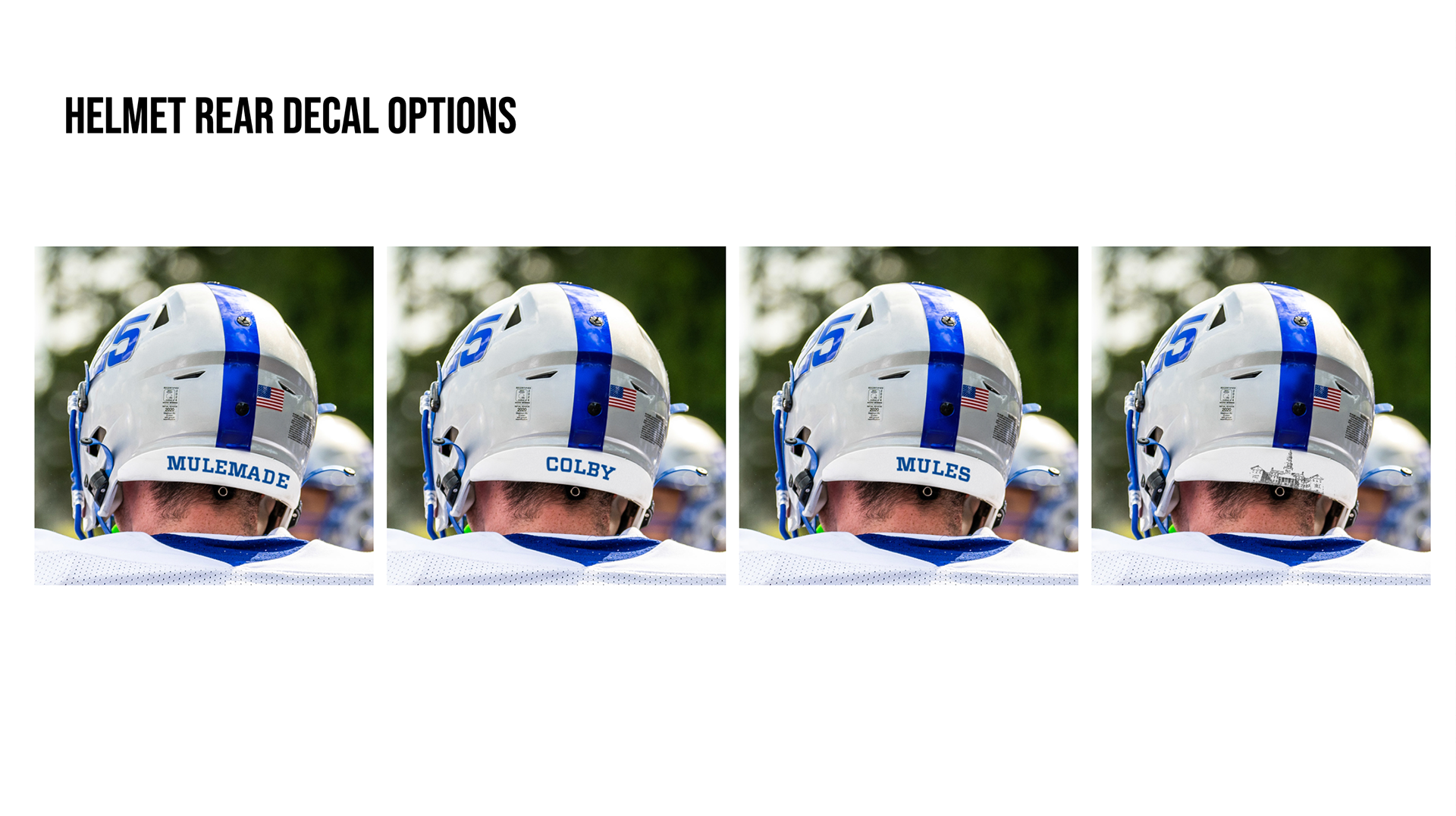
There were also uniform mockups for home, away, and a future alternate plus potential helmet tweaks like a side Mule logo or a “Colby C” rear decal.
__________
Making It Happen
After a couple of weeks of back and forth, the decision was made: we would order home and away jerseys, along with silver pants, for the 2025 season. Then, in 2026, we’d add an alternate jersey and two more pant options to expand our mix-and-match capabilities.
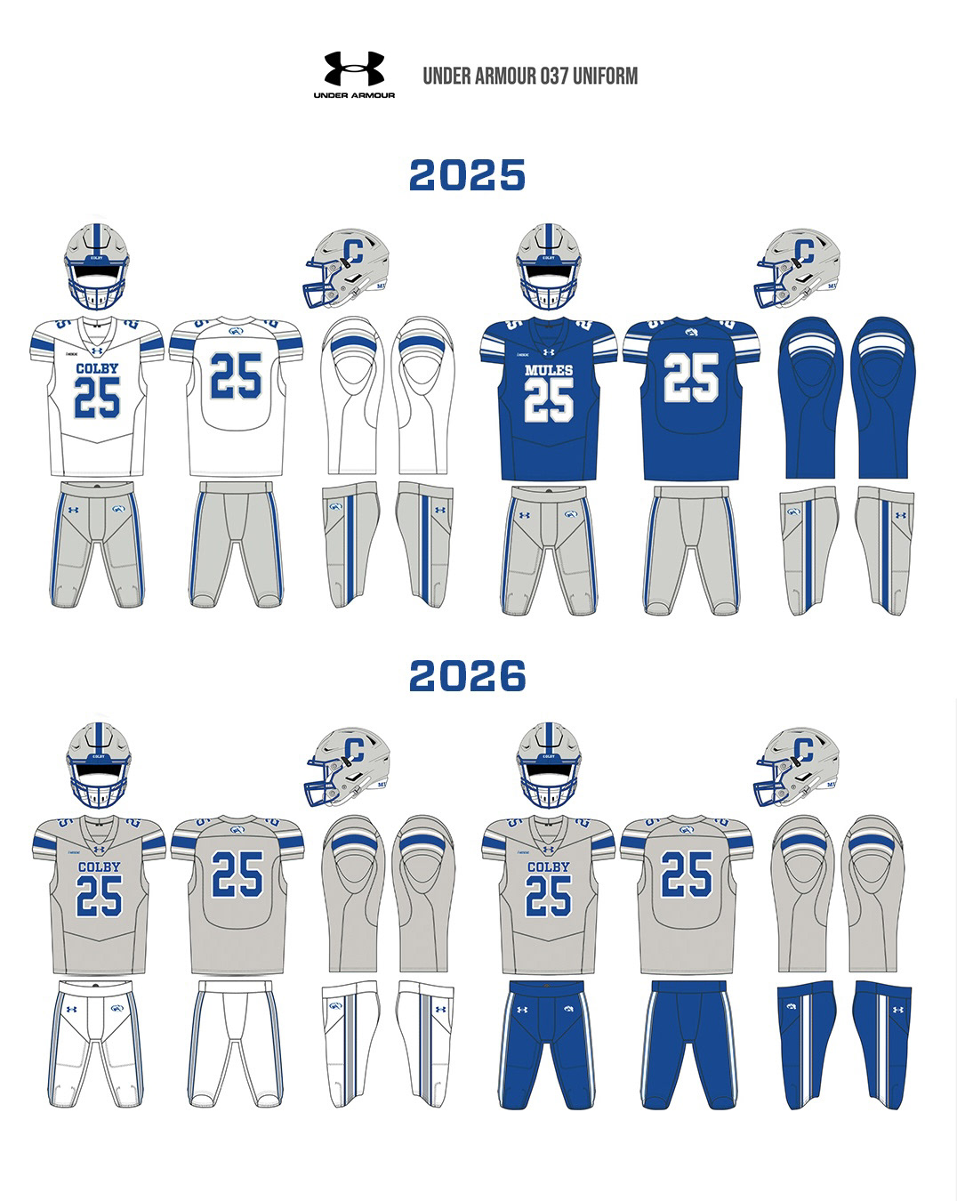
This was a big change. From 2019 to 2024, Colby Football only wore blue and white, and the silver pants (which matched our helmets) had basically disappeared. We’re bringing them back in 2025 and it’s a nod to both the past and the future of our look.
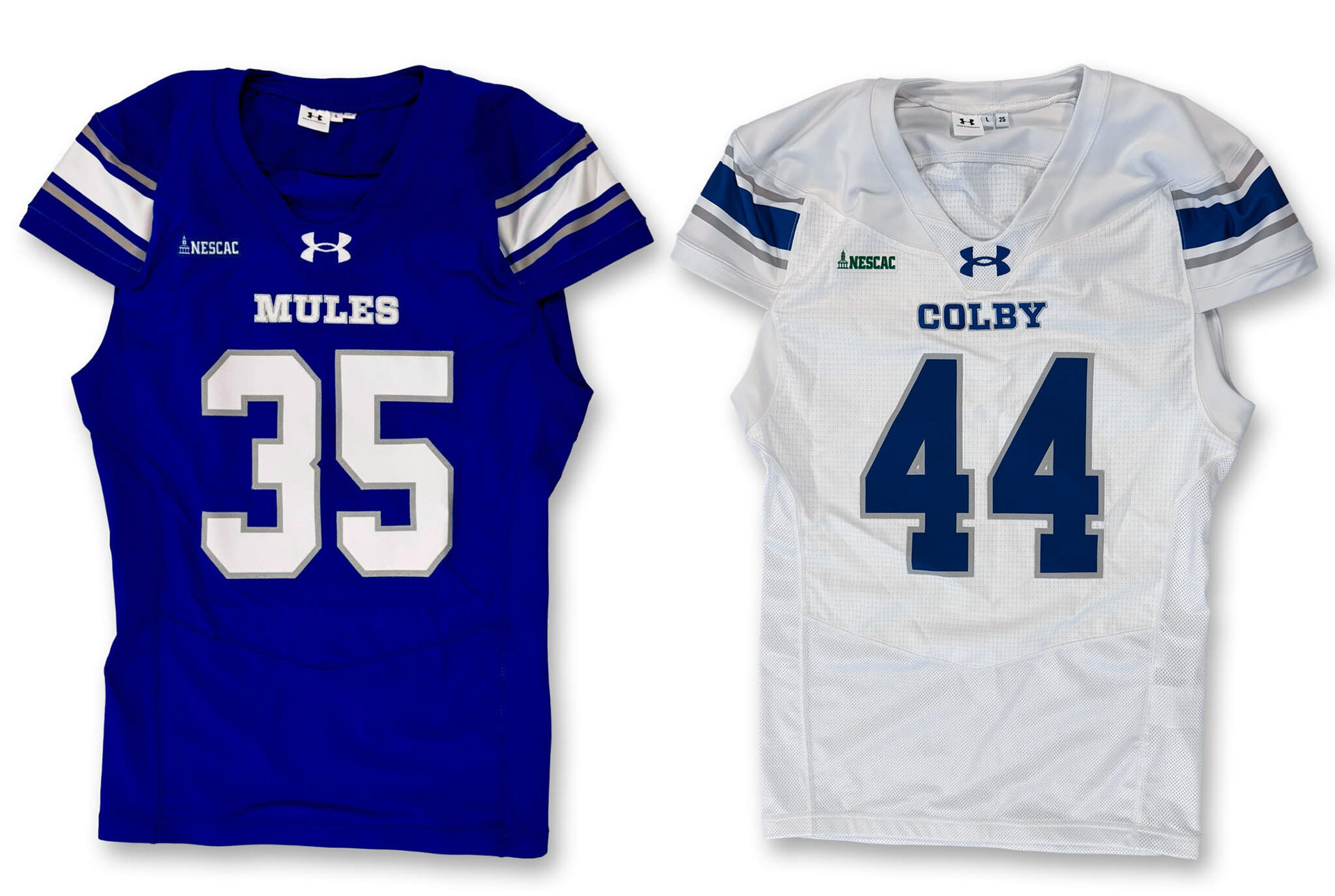
Some elements from my original concept didn’t make the final cut. The Mule logo on the back collar was removed to cut costs. And TV numbers were taken off because our coaches felt they would clash with the helmet numbers. Additionally, by conference rule, the NESCAC logo can only be green or white, so the patch on the white uniform is green. But I’m still incredibly proud of how the final product turned out.
__________
The Final Design
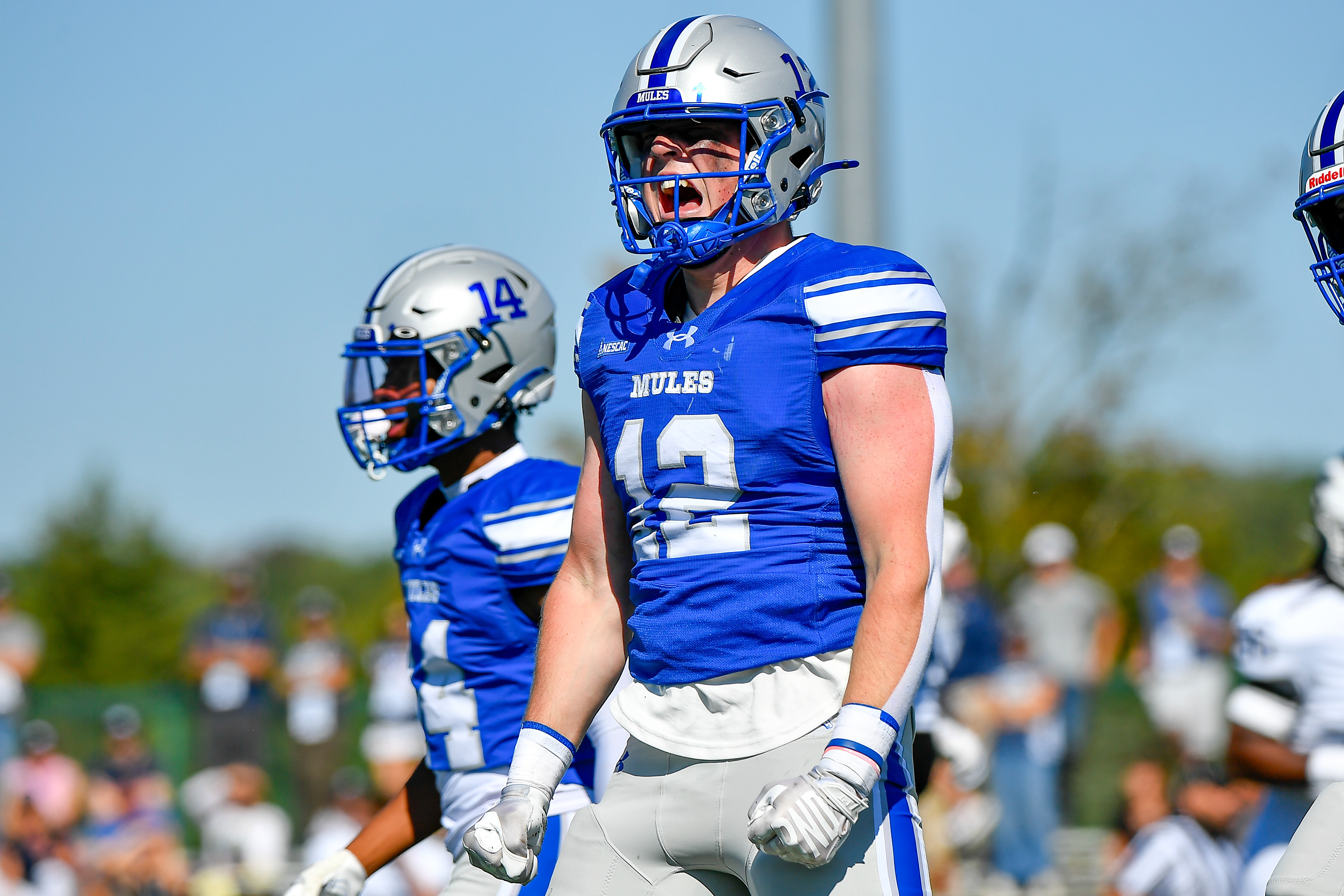
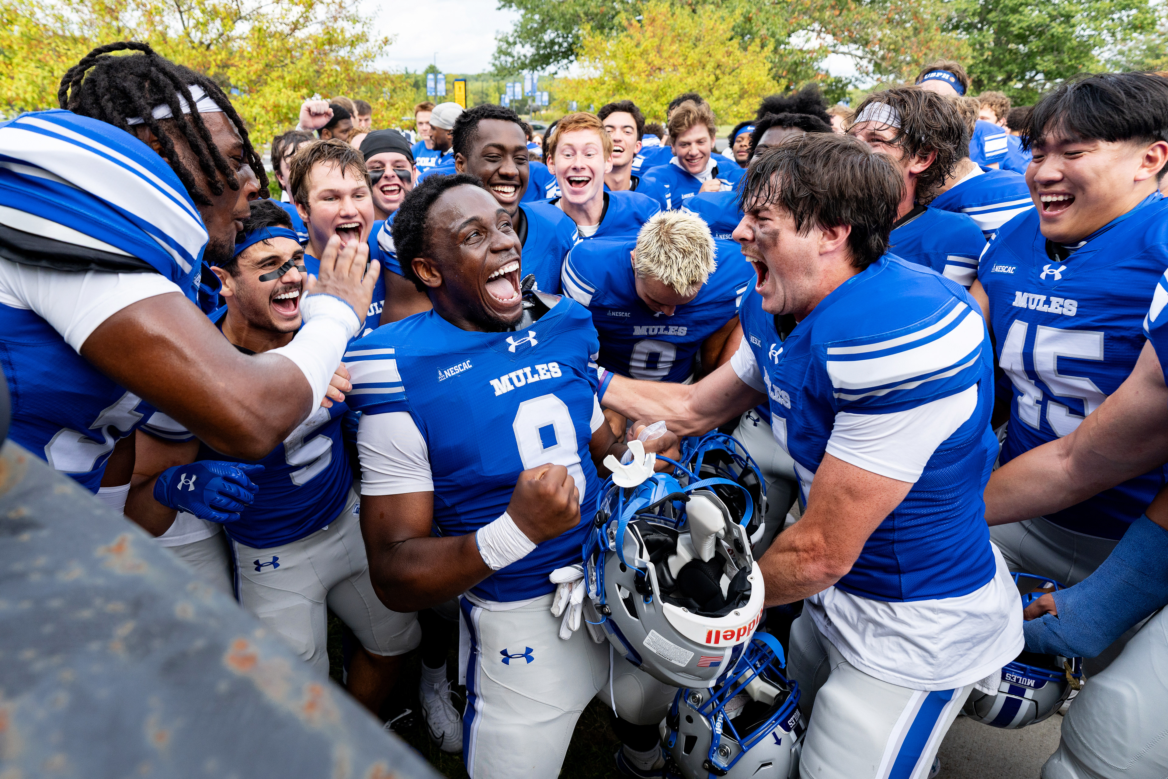
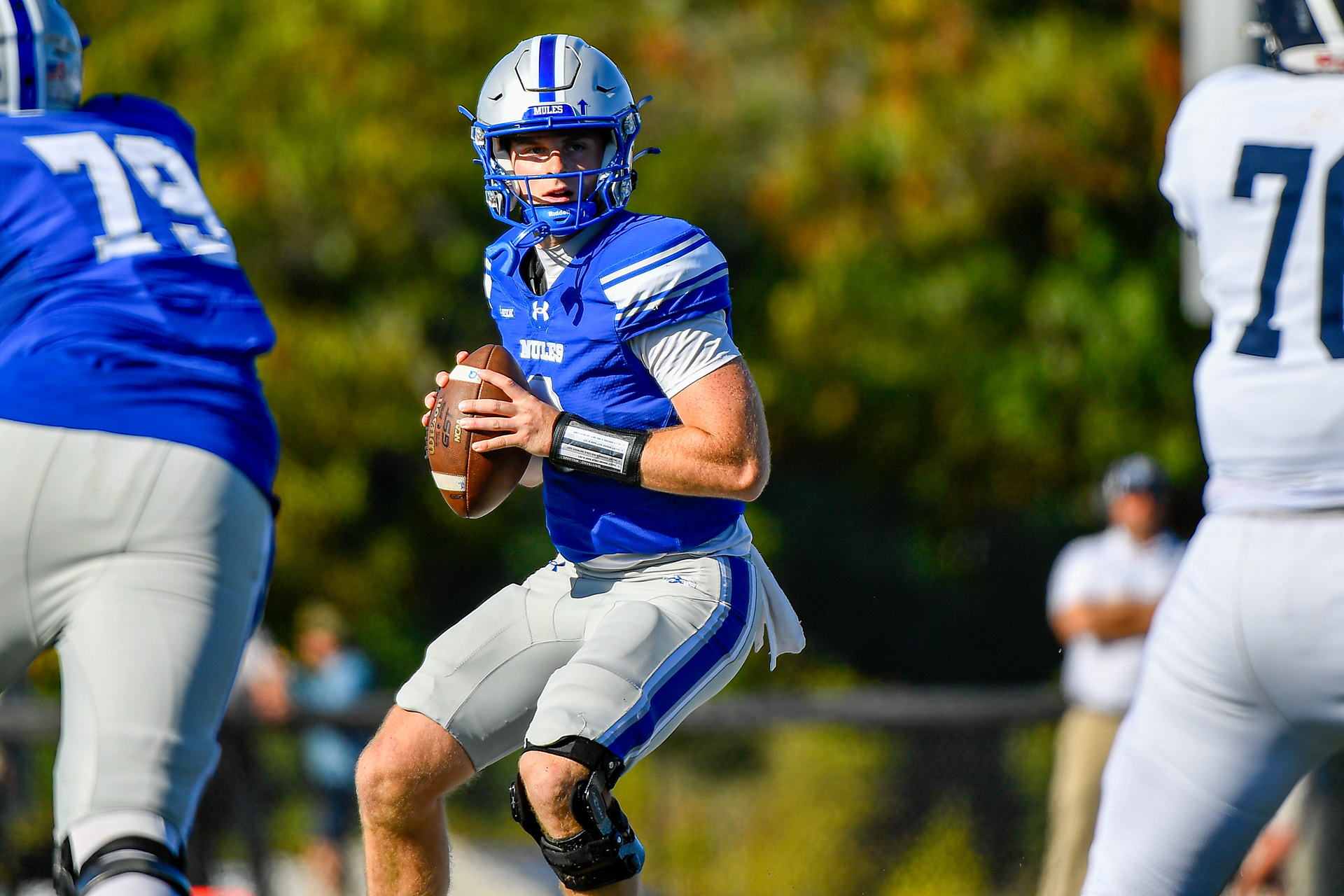
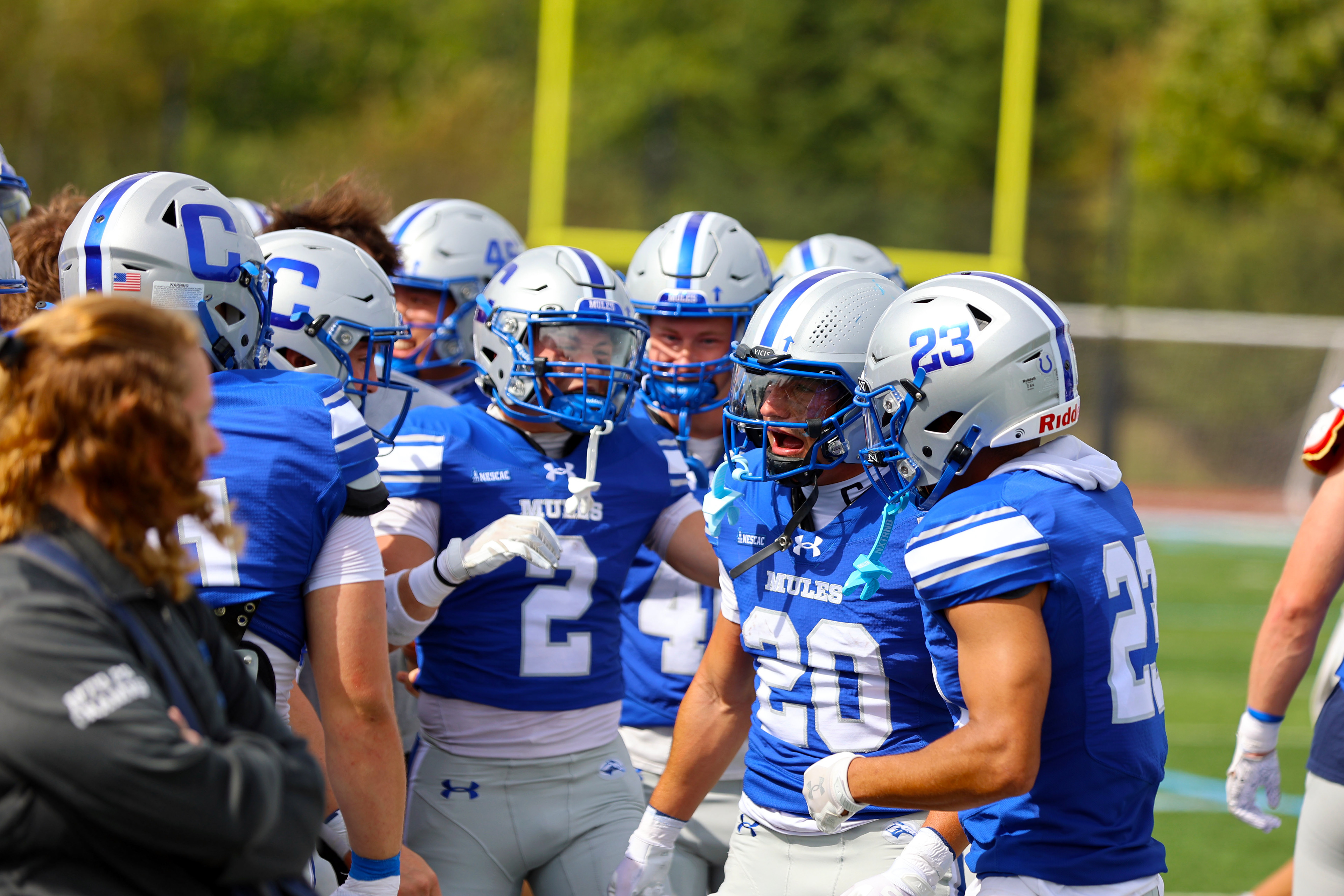
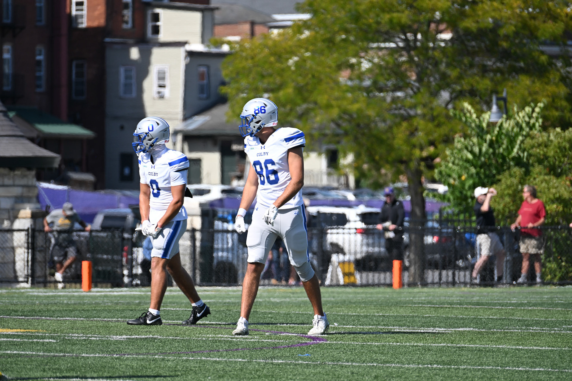
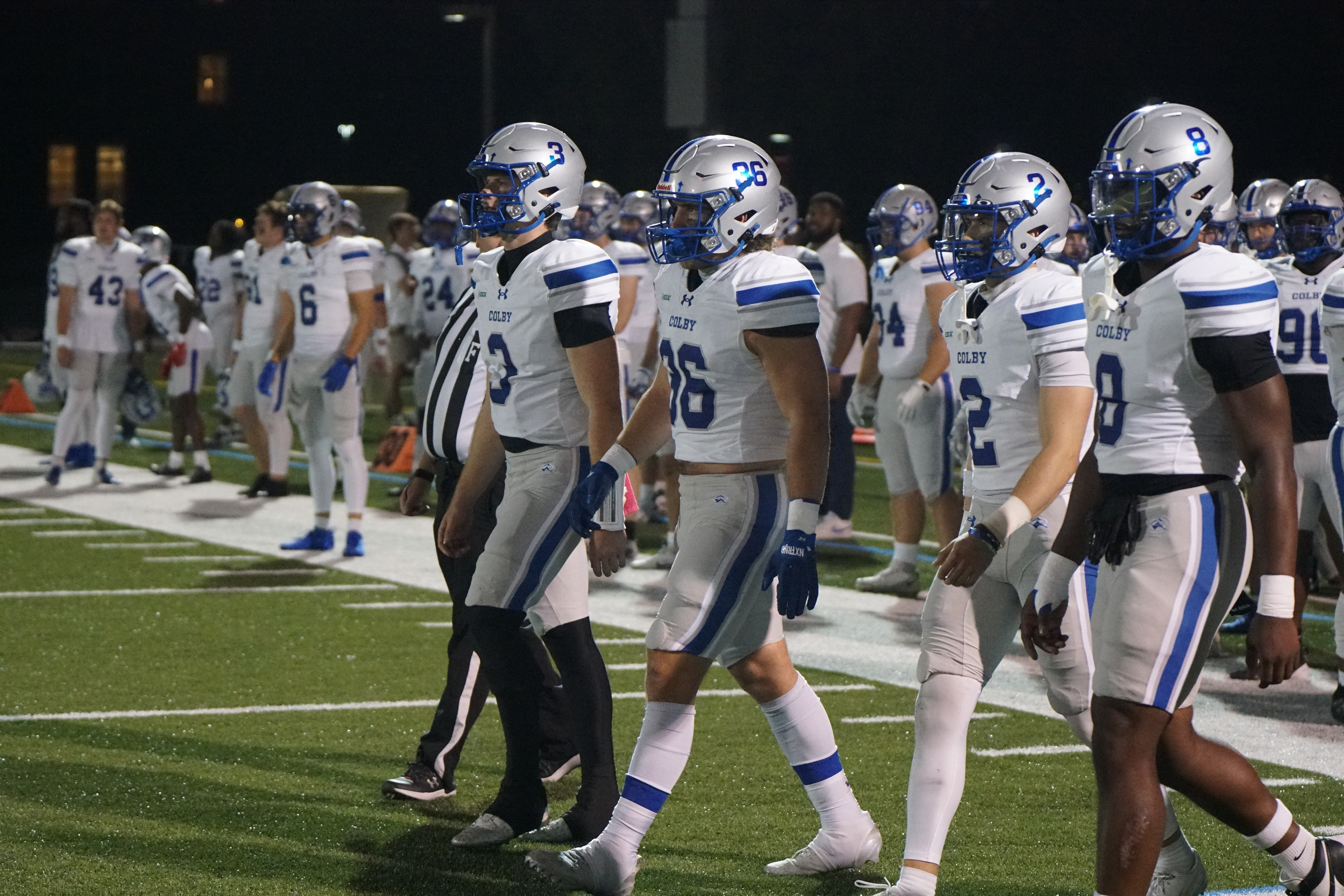
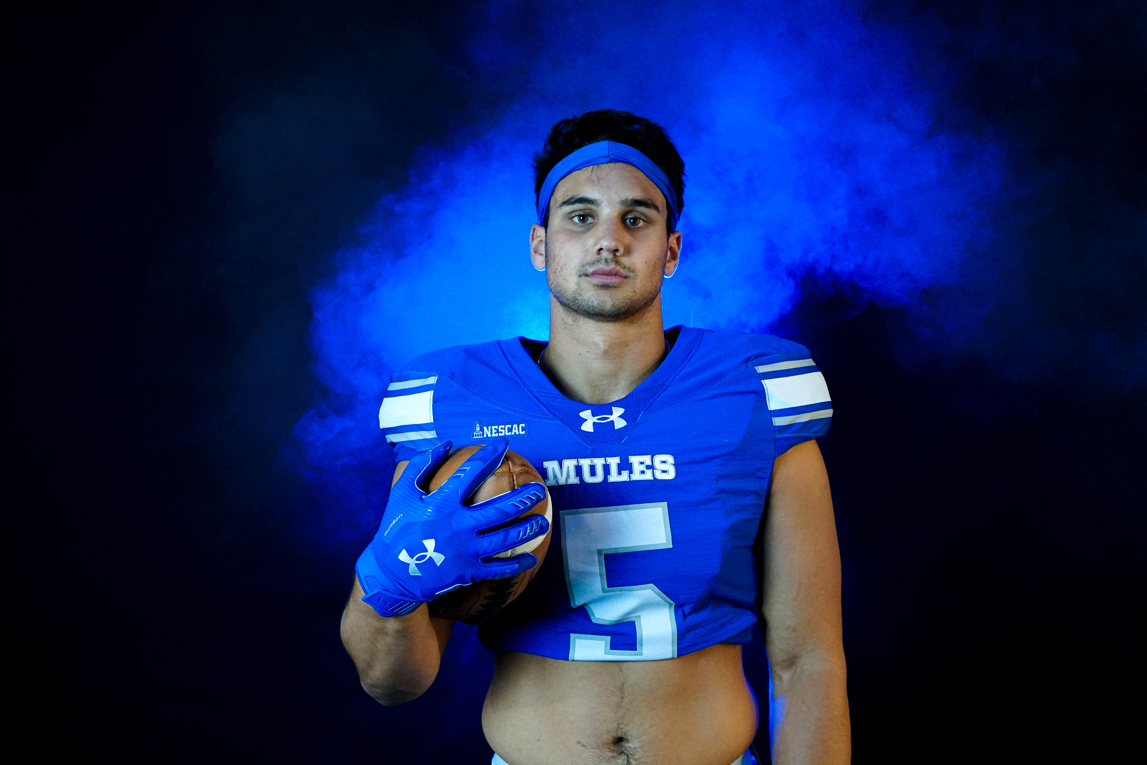
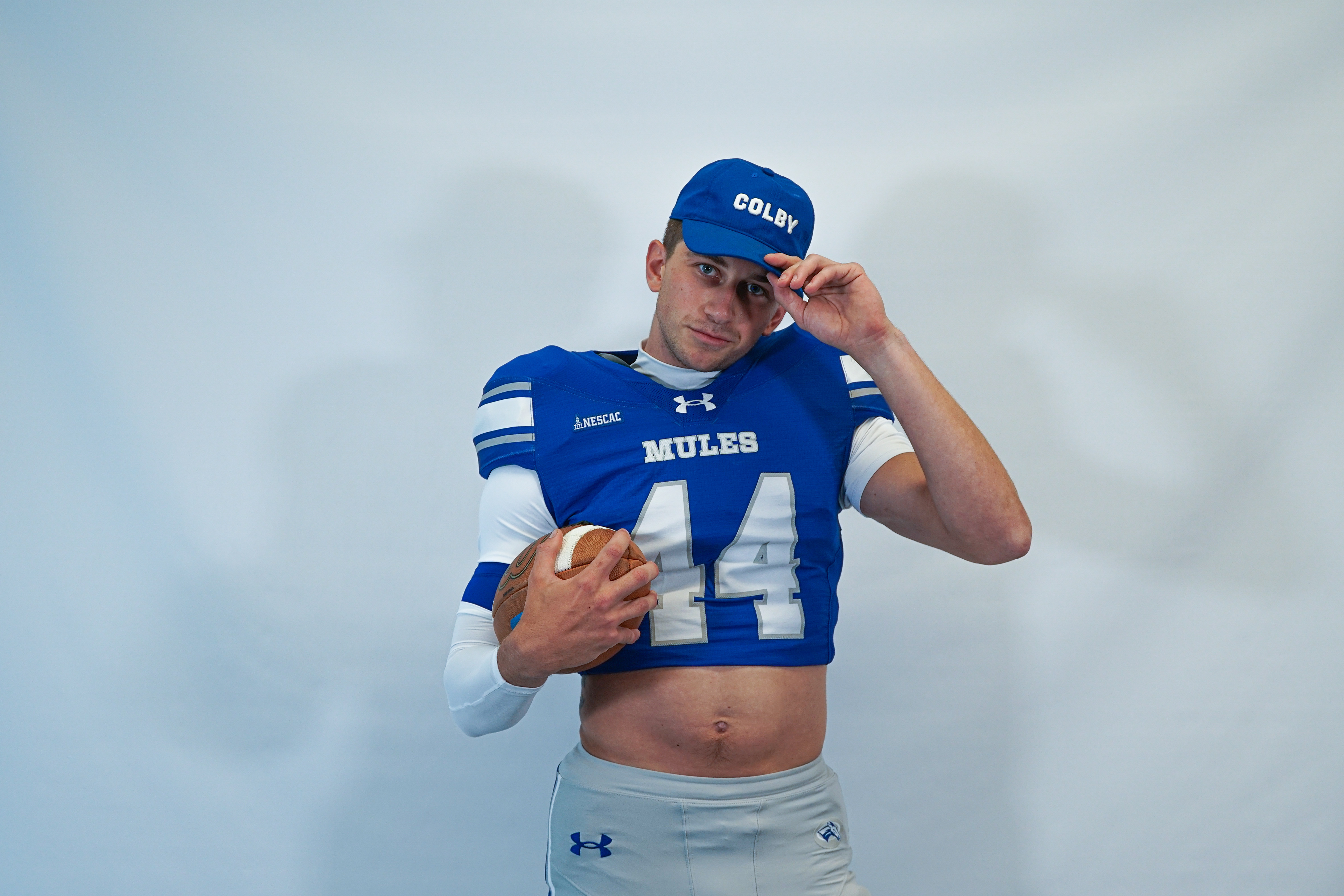
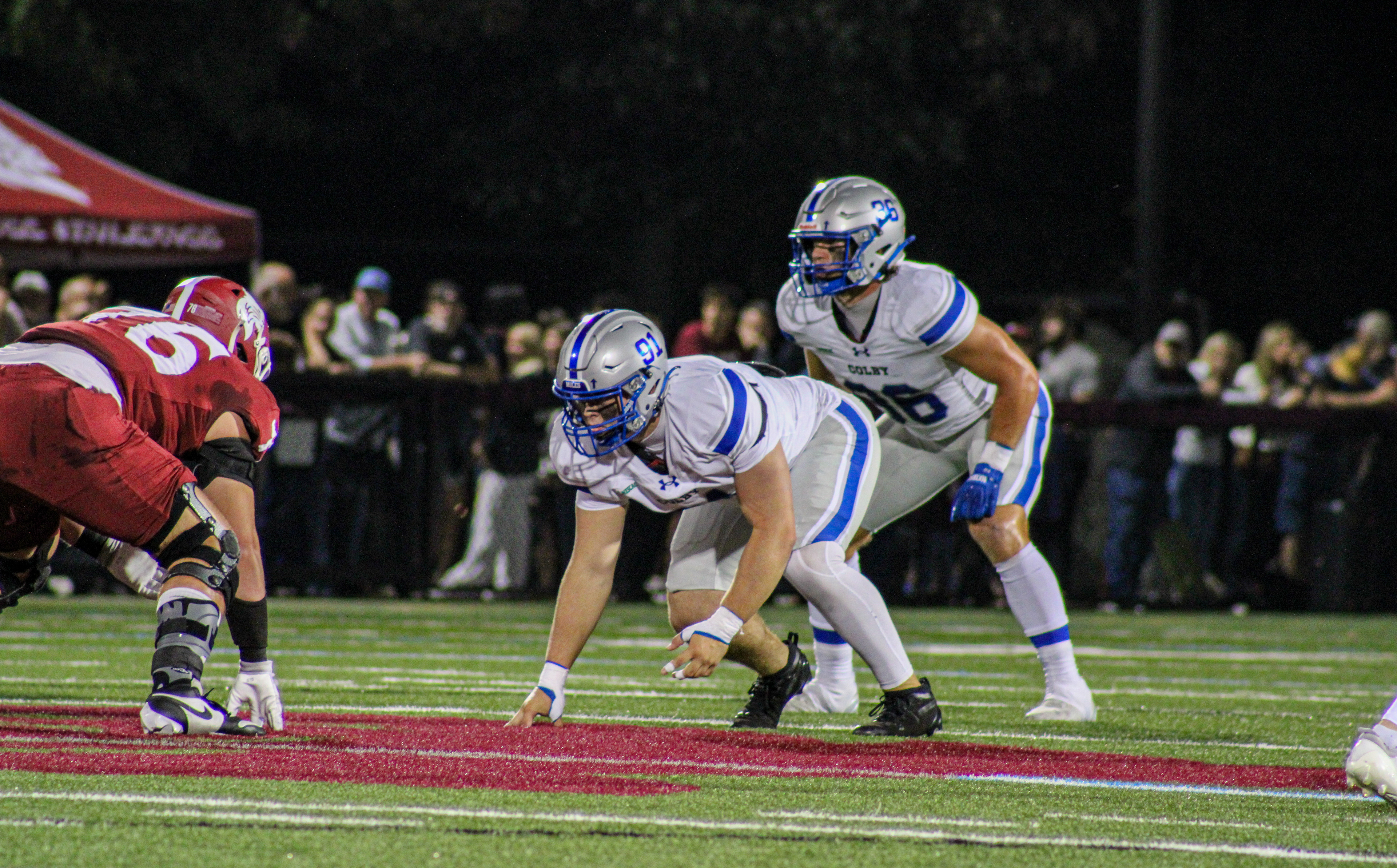
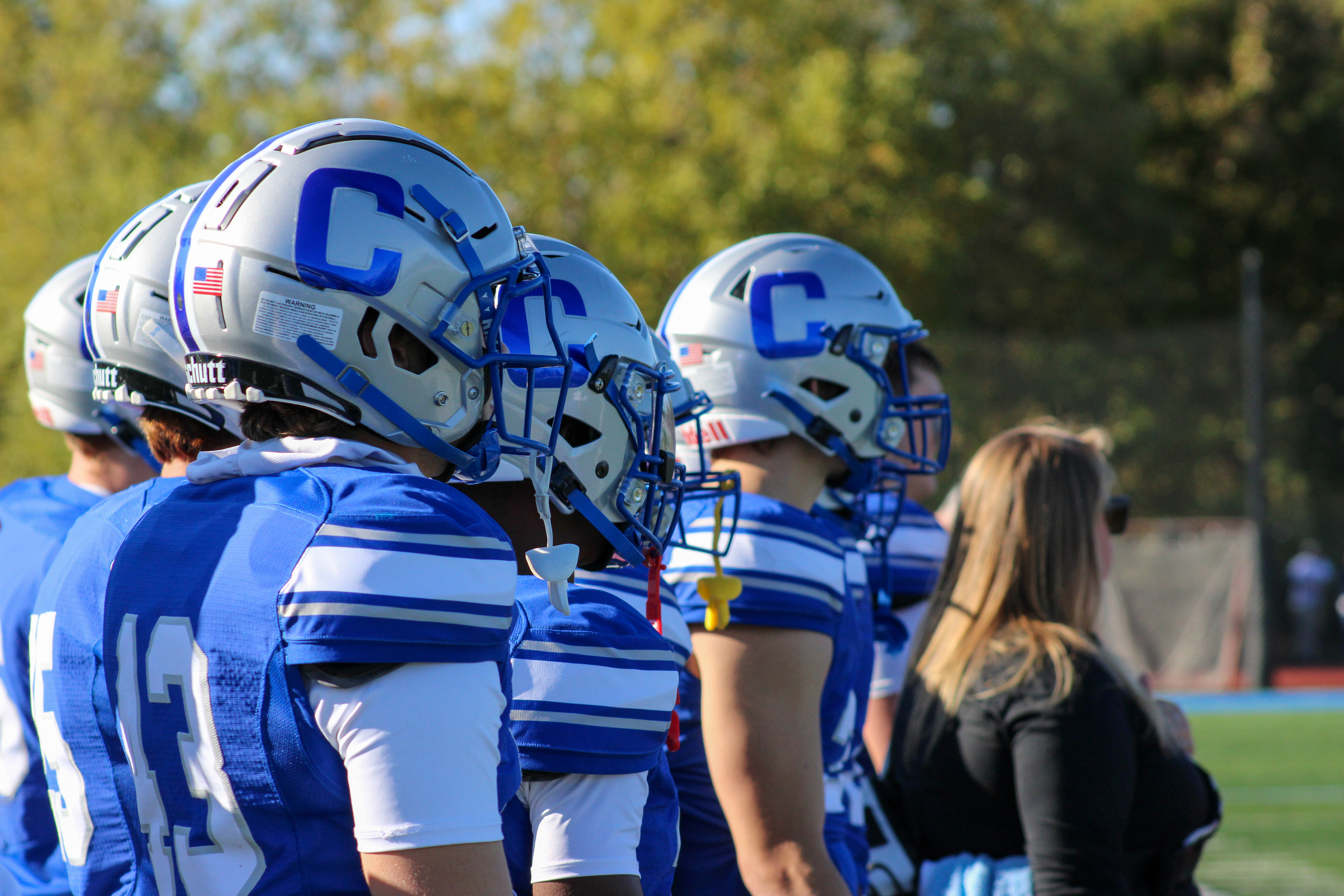
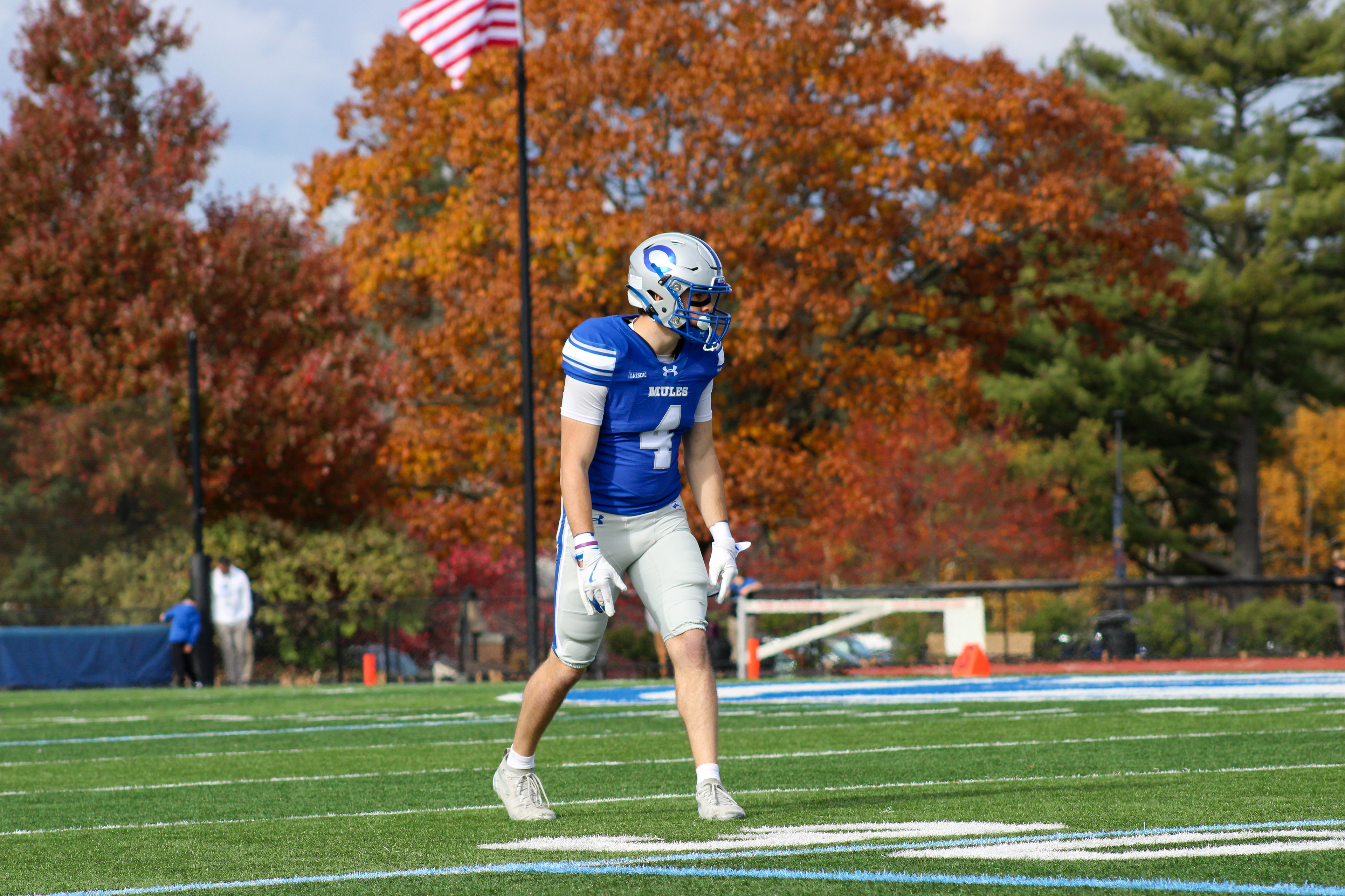
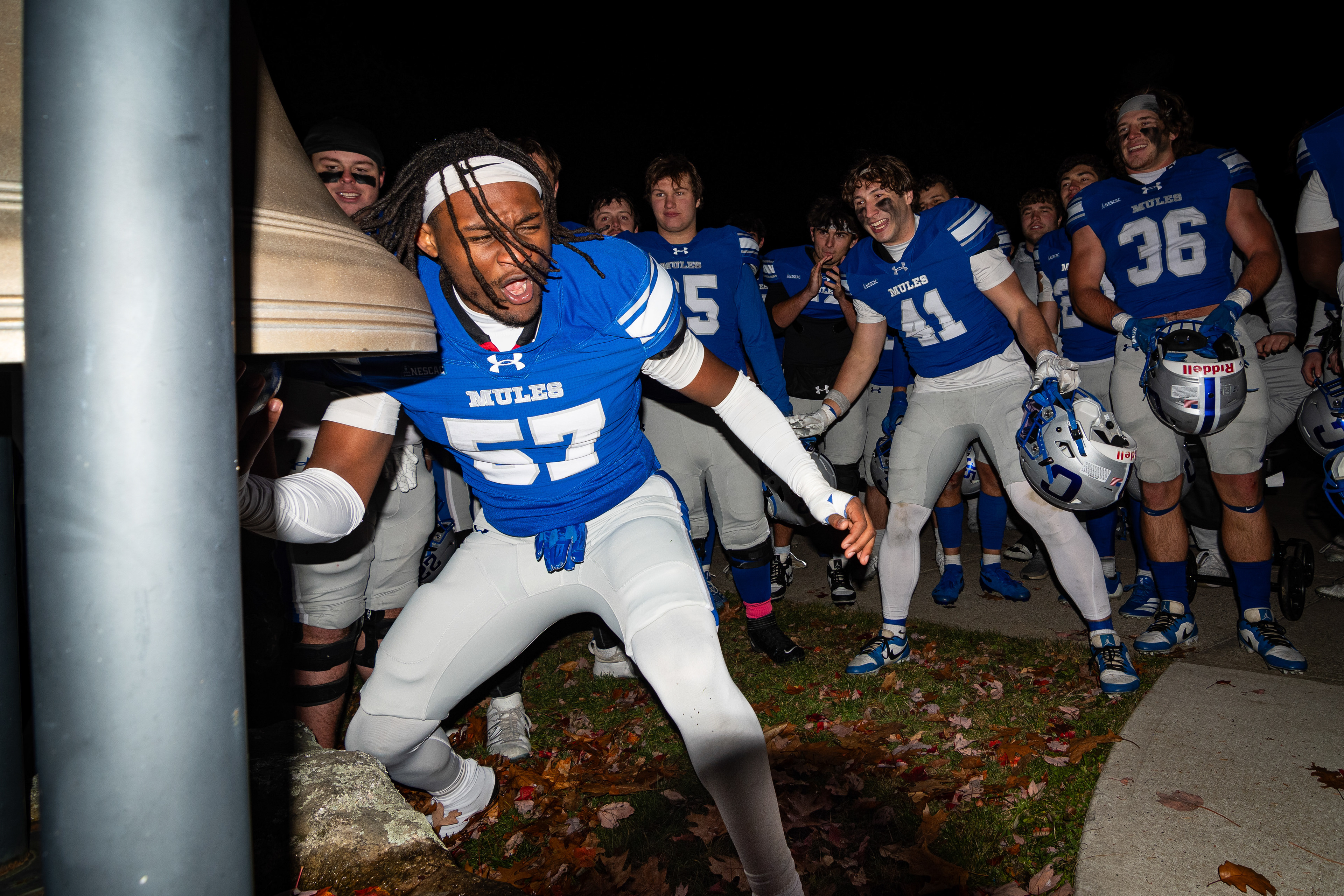
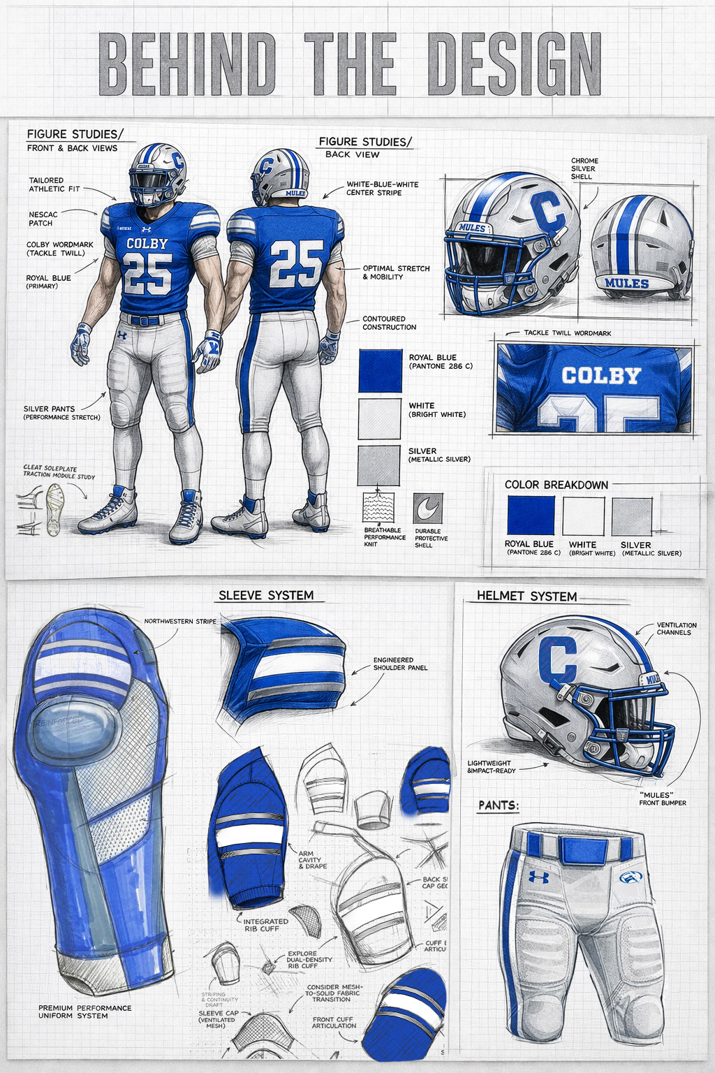
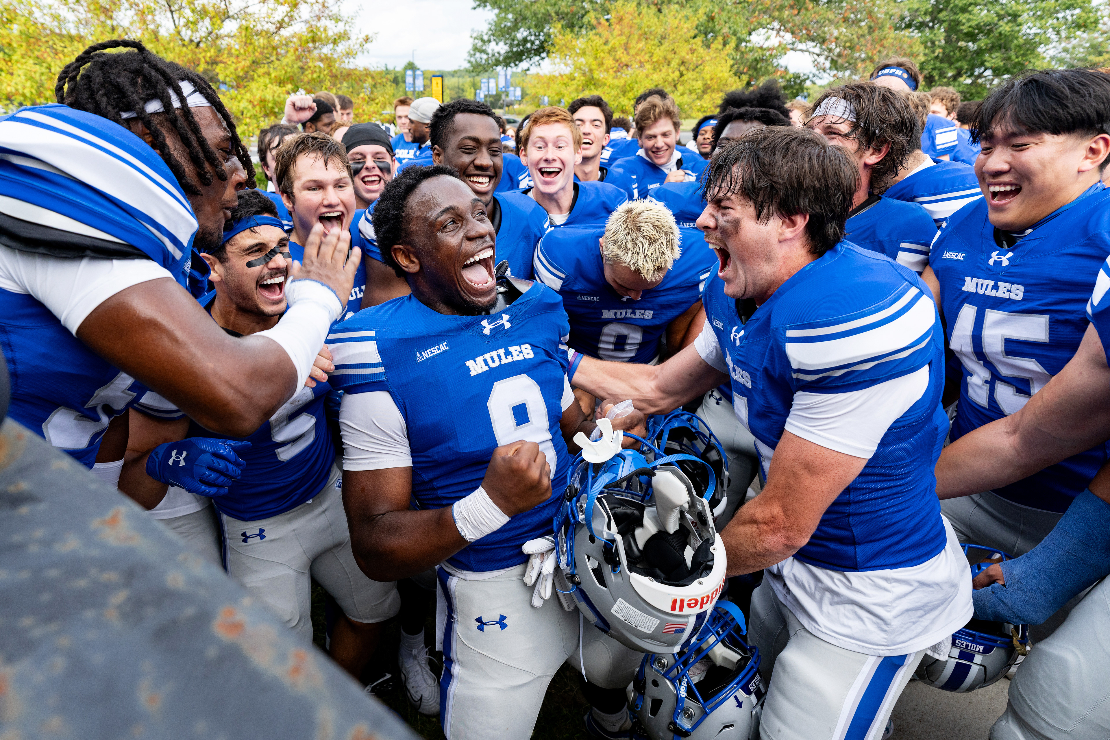
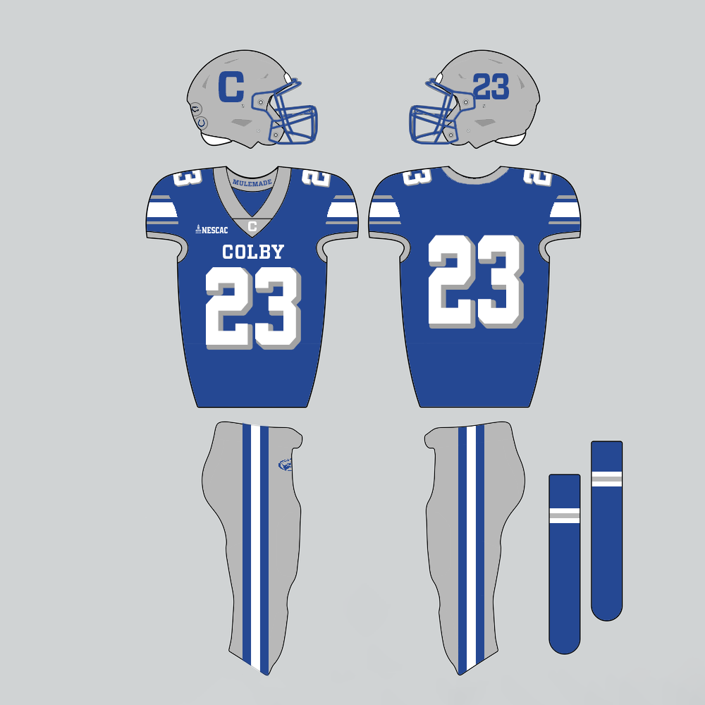
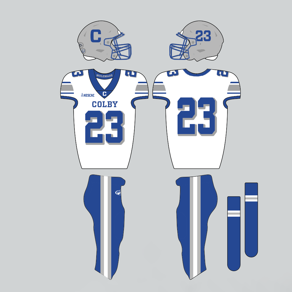
The final design is clean, bold, and unmistakably Colby. It features:
- A larger, bolder “COLBY” across the chest
- Consistent striping on the sleeves and pants
- Larger numbers for clarity and legibility
- A classic silver pant with modern tailoring
- Room for future alternates and brand elements
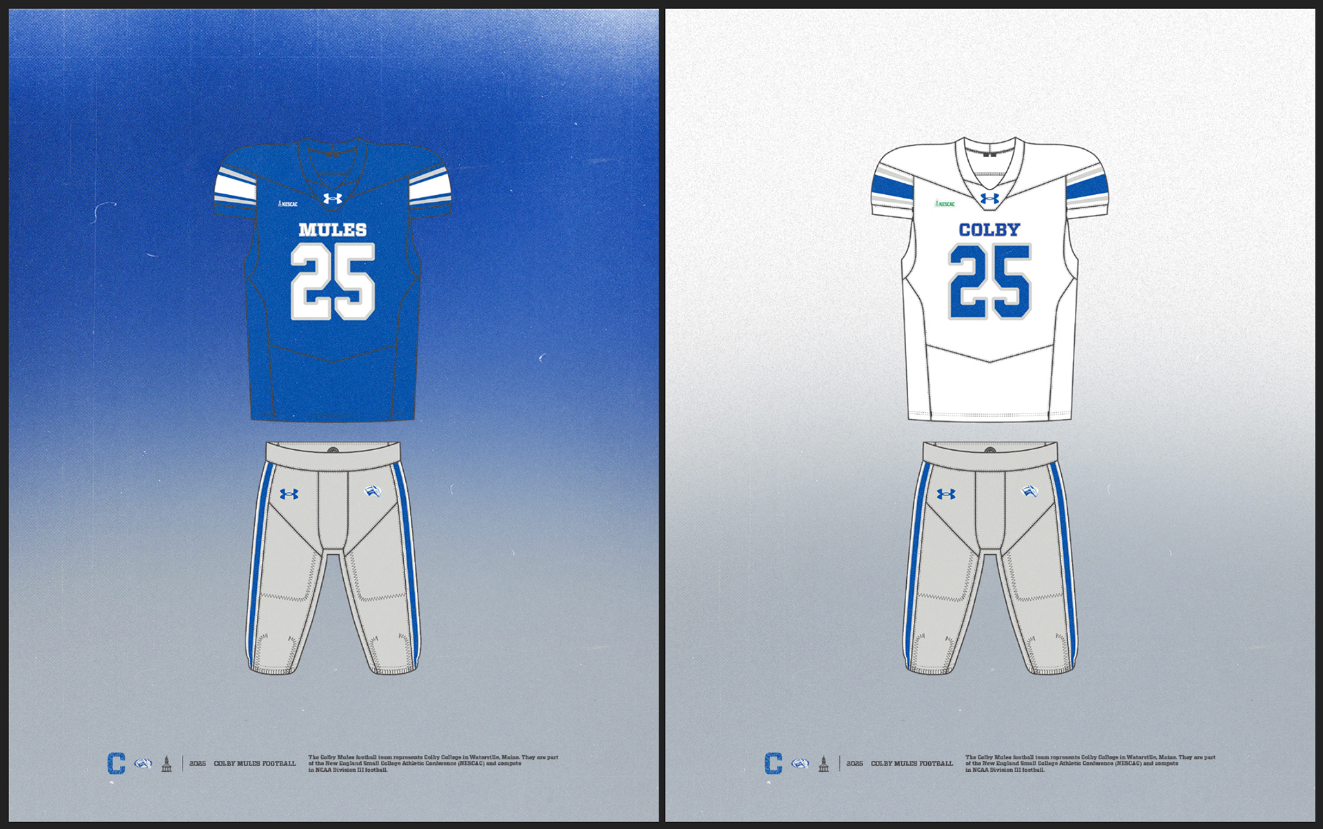
Even with the changes, the DNA of the original concept is intact. The new look feels like a proper identity for our team, something that connects players, fans, and recruits.
__________
Reflection
To have been trusted with something this meaningful during my senior year, and to see it all come to life for next season, has been incredible. I am so grateful to my coaches for the opportunity as well as our equipment manager. This was by far the coolest project I’ve gotten to work on at Colby and I'm looking forward to working on more uniform designs in the future.